<body> of your HTML to interact with your flow.
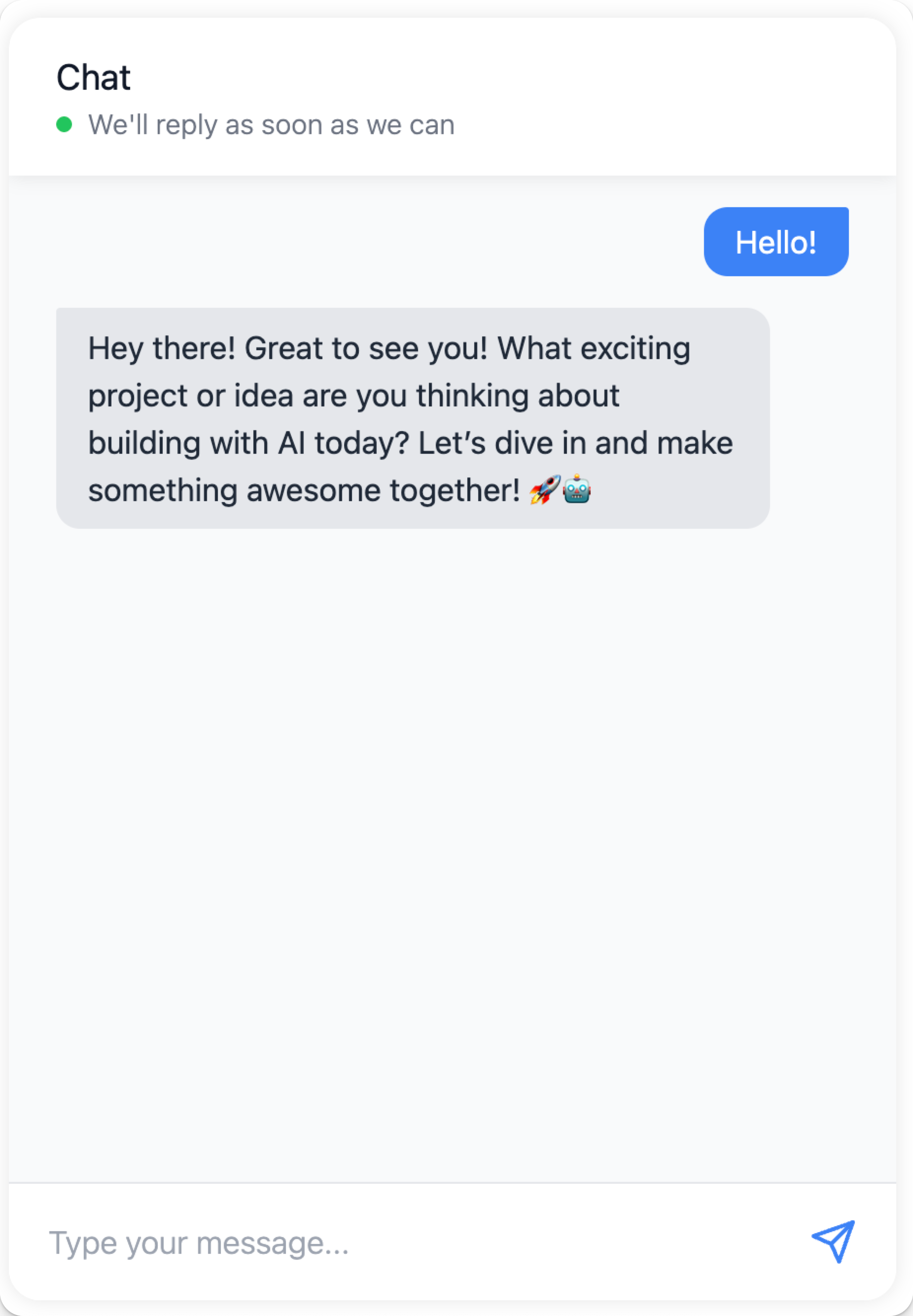
The chat widget is implemented as a web component called llmc-chat and is loaded from a CDN.
The following example includes the minimum required inputs, called props in React, for using the chat widget in your HTML code, which are host_url and flow_id. The host_url value must be HTTPS, and may not include a / after the URL. The flow_id value is found in your LLM Controls URL. For an LLM Controls server running the Basic prompting flow at https://c822-73-64-93-151.ngrok-free.app/flow/dcbed533-859f-4b99-b1f5-16fce884f28f, your chat widget code is similar to the following:
Embed the chat widget with React
To use the chat widget in your React application, create a component that loads the widget script and renders the chat interface:- Declare your web component and encapsulate it in a React component.
-
Place the component anywhere in your code to display the chat widget.
For example, in this docset, the React widget component is located at
docs > src > components > ChatWidget > index.tsx.index.tsxincludes a script to load the chat widget code from CDN and initialize theChatWidgetcomponent with props pointing to a LLM Controls server. - To import the component to your page, add this to your site.
-
To add the widget to your page, include
<ChatWidget className="my-chat-widget" />.
Embed the chat widget with Angular
To use the chat widget in your Angular application, create a component that loads the widget script and renders the chat interface. Angular requires you to explicitly allow custom web components likellmc-chat in components, so you must add the <llmc-chat> element to your Angular template and configure Angular to recognize it. Add CUSTOM_ELEMENTS_SCHEMA to your module’s configuration to enable this.
To add CUSTOM_ELEMENTS_SCHEMA to your module’s configuration, do the following:
- Open the module file
.module.tswhere you want to add thellmc-chatweb component. - Import
CUSTOM_ELEMENTS_SCHEMAat the top of the.module.tsfile:
import { NgModule, CUSTOM_ELEMENTS_SCHEMA } from '@angular/core';
-
Add
CUSTOM_ELEMENTS_SCHEMAto theschemasarray inside the@NgModuledecorator: -
Add the chat widget to your component’s template by including the
llmc-chatelement in your component’s.component.tsfile: For style properties that acceptJSONobjects likechat_window_styleandbot_message_style, use Angular’s property binding syntax[propertyName]to pass them as JavaScript objects.
Chat widget configuration
Props with the typeJSON need to be passed as stringified JSON (i.e., '{"key":"value"}').
| Prop | Type | Description |
|---|---|---|
flow_id | String | Required. The flow’s unique ID. |
host_url | String | Required. Base URL of LLM Controls server (HTTPS, no trailing /) |
api_key | String | Optional API key for auth. |
session_id | String | Custom session ID. |
additional_headers | JSON | Extra HTTP headers. |
height, width | Number | Dimensions of the widget. |
chat_position | String | top-left, bottom-right, etc. |
start_open | Boolean | Whether the chat window opens automatically. |
chat_window_style | JSON | Full widget styling. |
chat_trigger_style | JSON | Trigger button styling. |
bot_message_style | JSON | Bot message appearance. |
user_message_style | JSON | User message appearance. |
error_message_style | JSON | Error styling. |
input_style | JSON | Chat input box. |
input_container_style | JSON | Chat input container. |
send_button_style | JSON | Send button. |
send_icon_style | JSON | Icon for send button. |
window_title | String | Widget header title. |
placeholder | String | Input placeholder. |
placeholder_sending | String | Placeholder while sending. |
online | Boolean | Toggle online state. |
online_message | String | Message shown when online. |
input_type | String | Chat input type. |
output_type | String | Chat output type. |
output_component | String | Which component to route output to. |
chat_output_key | String | Output key to render. |
tweaks | JSON | Custom tweaks for flow. |